Lab-6: Part-B (Wrangling Dataframes)
(Intro. to Data Science: IIT Delhi - Abu Dhabi)
B. Wrangling Dataframes
We often need to perform preparatory work on our data before we can begin our analysis. The amount of preparation can vary widely, but there are a few basic steps to move from raw data to data ready for analysis. Earlier labs addressed the initial steps of creating a dataframe from a plain-text source. In this chapter, we assess quality. To do this, we perform validity checks on individual data values and entire columns. In addition to checking the quality of the data, we determine whether or not the data need to be transformed and reshaped to get ready for analysis. Quality checking (and fixing) and transformation are often cyclical: the quality checks point us toward transformations we need to make, and when we check the transformed columns to confirm that our data are ready for analysis, we may discover they need further cleaning.
Depending on the data source, we often have different expectations for quality. Some datasets require extensive wrangling to get them into an analyzable form, and others arrive clean and we can quickly launch into modeling. Here are some examples of data sources and how much wrangling we might expect to do:
- Data from a scientific experiment or study are typically clean, are well documented, and have a simple structure. These data are organized to be broadly shared so that others can build on or reproduce the findings. They are typically ready for analysis after little to no wrangling.
- Data from government surveys often come with very detailed codebooks and metadata describing how the data are collected and formatted, and these datasets are also typically ready for exploration and analysis right out of the "box."
- Administrative data can be clean, but without inside knowledge of the source, we may need to extensively check their quality. Also, since we often use these data for a purpose other than why they were collected in the first place, we may need to transform features or combine data tables.
- Informally collected data, such as data scraped from the web, can be quite messy and tends to come with little documentation. For example, texts, tweets, blogs, and Wikipedia tables. usually require formatting and cleaning to transform them into information ready for analysis.
In this chapter, we break down data wrangling into the following stages: assess data quality; handle missing values; transform features; and reshape the data by modifying its structure and granularity. An important step in assessing the quality of the data is to consider its scope. Data scope is covered in [LDS], and we refer you there for a fuller treatment of the topic.
To clean and prepare data, we also rely on exploratory data analysis, especially visualizations. In this lab, however, we focus on data wrangling and cover these other, related topics in more detail in later labs.
We use the datasets introduced in Part A: the DAWN government survey of emergency room visits related to drug abuse and the San Francisco administrative data on food safety inspections of restaurants. But we begin by introducing the various data wrangling concepts through another example that is simple enough and clean enough that we can limit our focus in each of the wrangling steps.
B.1 Example: Wrangling CO2 Measurements from the Mauna Loa Observatory
The National Oceanic and Atmospheric Administration (NOAA) monitors CO2 concentrations in the air at the Mauna Loa Observatory. We work with this example and use it to introduce how to make data-quality checks, handle missing values, transform features, and reshape tables. These data are in the file data/co2_mm_mlo.txt. Let's begin by figuring out the formatting, encoding, and size of the source before we load it into a dataframe.
from pathlib import Path
import os
import chardet

co2_file_path = Path('data') / 'co2_mm_mlo.txt'

[os.path.getsize(co2_file_path),
 chardet.detect(co2_file_path.read_bytes())['encoding']]
[51131, 'ascii']
We have found that the file is plain text with ASCII encoding and about 50 KiB in size. Since the file is not particularly large, we should have no trouble loading it into a dataframe, but first we need to determine the file's format. Let's look at the first few lines in the file:
lines = co2_file_path.read_text().split('\n')
len(lines)
811
lines[:6]
['# --------------------------------------------------------------------',
 '# USE OF NOAA ESRL DATA',
 '# ',
 '# These data are made freely available to the public and the',
 '# scientific community in the belief that their wide dissemination',
 '# will lead to greater understanding and new scientific insights.']
We see that the file begins with information about the data source. We should read this documentation before starting our analysis, but sometimes the urge to plunge into the analysis wins over and we just start mucking about and discover properties of the data as we go. So let us quickly find where the actual data values are located:
lines[65:75]
['#',
 '# CO2 expressed as a mole fraction in dry air, micromol/mol, abbreviated as ppm',
 '#',
 '#  (-99.99 missing data;  -1 no data for #daily means in month)',
 '#',
 '#            decimal     average   interpolated    trend    #days',
 '#             date                             (season corr)',
 '1958   3    1958.208      315.71      315.71      314.62     -1',
 '1958   4    1958.292      317.45      317.45      315.29     -1',
 '1958   5    1958.375      317.50      317.50      314.71     -1']
We have found that the data begins on the 73rd line of the file (given we start counting from 1). We also spot some relevant characteristics:
- The values are separated by whitespace, possibly tabs.
- The data line up down the rows. For example, the month appears in seventh to eighth position of each line.
- The column headings are split over two lines.
We can use read_csv to read the data into a pandas DataFrame and provide arguments to specify that the separators are whitespace, there is no header (we will set our own column names), and to skip the first 72 rows of the file:
import pandas as pd
co2 = pd.read_csv('data/co2_mm_mlo.txt',
                  header=None, skiprows=72, sep='\s+',
                  names=['Yr', 'Mo', 'DecDate', 'Avg', 'Int', 'Trend', 'days'])
co2.head(3)
| Yr | Mo | DecDate | Avg | Int | Trend | days | |
|---|---|---|---|---|---|---|---|
| 0 | 1958 | 3 | 1958.208 | 315.71 | 315.71 | 314.62 | -1 |
| 1 | 1958 | 4 | 1958.292 | 317.45 | 317.45 | 315.29 | -1 |
| 2 | 1958 | 5 | 1958.375 | 317.50 | 317.50 | 314.71 | -1 |
We have successfully loaded the file contents into a dataframe, and we can see that the granularity of the data is a monthly average CO2, from 1958 through 2019. Also, the table shape is 738 by 7.
Since scientific studies tend to have very clean data, it's tempting to jump right in and make a plot to see how CO2 monthly averages have changed. The field DecDate conveniently represents the month and year as a numeric feature, so we can easily make a line plot:
from matplotlib.pyplot import subplots

fig, ax = subplots(figsize = (5, 5))
ax.plot(co2['DecDate'], co2['Avg']);

Yikes! Plotting the data has uncovered a problem. The four dips in the line plot look odd. What happened here? We can check a few percentiles of the dataframe to see if we can spot the problem:
co2.describe()
| Yr | Mo | DecDate | Avg | Int | Trend | days | |
|---|---|---|---|---|---|---|---|
| count | 738.000000 | 738.000000 | 738.000000 | 738.000000 | 738.000000 | 738.000000 | 738.000000 |
| mean | 1988.417344 | 6.491870 | 1988.916667 | 350.472087 | 354.496057 | 354.483523 | 18.472900 |
| std | 17.768275 | 3.444944 | 17.765545 | 52.214201 | 28.113985 | 28.031320 | 12.200271 |
| min | 1958.000000 | 1.000000 | 1958.208000 | -99.990000 | 312.660000 | 314.620000 | -1.000000 |
| 25% | 1973.000000 | 4.000000 | 1973.562750 | 328.587500 | 328.792500 | 329.730000 | -1.000000 |
| 50% | 1988.000000 | 6.000000 | 1988.916500 | 351.725000 | 351.725000 | 352.380000 | 25.000000 |
| 75% | 2004.000000 | 9.000000 | 2004.271000 | 377.000000 | 377.000000 | 377.177500 | 28.000000 |
| max | 2019.000000 | 12.000000 | 2019.625000 | 414.660000 | 414.660000 | 411.840000 | 31.000000 |
This time, looking a bit more closely at the range of values, we see that some data have unusual values like -1 and -99.99. If we read the information at the top of the file more carefully, we find that -99.99 denotes a missing monthly average and -1 signifies a missing value for the number of days the equipment was in operation that month. Even with relatively clean data, it's a good practice to read the documentation and make a few quality checks before jumping into the analysis stage.
B.1.1 Quality Checks
Let's step back for a moment and perform some quality checks. We might confirm that we have the expected number of observations; look for unusual values; and cross-check anomalies that we find to the values in other features.
First, we consider the shape of the data. How many rows should we have? From looking at the head and tail of the dataframe, the data appear to be in chronological order, beginning with March 1958 and ending with August 2019. This means we should have $ 12 \times (2019-1957) - 2 - 4 = 738 $ records, which we can check against the shape of the dataframe:
co2.shape
(738, 7)
Our calculations match the number of rows in the data table.
Next, let's check the quality of the features, starting with Mo. We expect the values to range from 1 to 12, and each month should have 2019 – 1957 = 62 or 61 instances (since the recordings begin in March of the first year and end in August of the most recent year):
co2["Mo"].value_counts().reindex(range(1,13)).tolist()
[61, 61, 62, 62, 62, 62, 62, 62, 61, 61, 61, 61]
As expected, Jan, Feb, Sep, Oct, Nov, and Dec have 61 occurrences and the rest 62.
Now let's examine the column called days with a histogram:
fig, ax = subplots(figsize = (5, 5))
ax.hist(co2['days']);

We see that a handful of months have averages based on measurements taken on fewer than half the days. In addition, there are nearly 200 missing values. A scatterplot can help us cross-check missing data against the year of the recording:
fig, ax = subplots(figsize = (5, 5))
ax.scatter(co2['Yr'], co2['days']);

The line along the bottom left of the plot shows us that all of the missing data are in the early years of operation. The number of days of operation of the equipment may not have been collected in the early days. It also appears that there might have been problems with the equipment in the mid- to late '80s. What do we do with these conjectures? We can try to confirm them by looking through documentation about the historical readings. If we are concerned about the impact on the CO2 averages for records with missing values for the number of days of operation, then a simple solution would be to drop the earliest recordings. However, we would want to delay such action until after we have examined the time trends and assess whether there are any potential problems with the CO2 averages in those early days.
Next, let's return to the -99.99 values for the average CO2 measurement and begin our checks with a histogram:
fig, ax = subplots(figsize = (5, 5))
ax.hist(co2['Avg'], bins = 50);

The recorded values are in the 300–400 range, which is what we expect based on our research into CO2 levels. We also see that there are only a few missing values. Since there aren't many missing values, we can examine all of them:
co2[co2["Avg"] < 0]
| Yr | Mo | DecDate | Avg | Int | Trend | days | |
|---|---|---|---|---|---|---|---|
| 3 | 1958 | 6 | 1958.458 | -99.99 | 317.10 | 314.85 | -1 |
| 7 | 1958 | 10 | 1958.792 | -99.99 | 312.66 | 315.61 | -1 |
| 71 | 1964 | 2 | 1964.125 | -99.99 | 320.07 | 319.61 | -1 |
| 72 | 1964 | 3 | 1964.208 | -99.99 | 320.73 | 319.55 | -1 |
| 73 | 1964 | 4 | 1964.292 | -99.99 | 321.77 | 319.48 | -1 |
| 213 | 1975 | 12 | 1975.958 | -99.99 | 330.59 | 331.60 | 0 |
| 313 | 1984 | 4 | 1984.292 | -99.99 | 346.84 | 344.27 | 2 |
We are faced with the question of what to do with the -99.99 values. We have seen already the problems of leaving these values as is in a line plot. There are several options, and we describe them next.
B.1.2 Addressing Missing Data
The -99.99s for average CO2 levels indicate missing recordings. These interfere with our statistical summaries and plots. It's good to know which values are missing, but we need to do something about them. We might drop those records, replace -99.99 with NaN, or substitute 99.99 with a likely value for the average CO2. Let's examine each of these three options.
Note that the table already comes with a substitute value for the -99.99. The column labeled Int has values that exactly match those in Avg, except when Avg is -99.99, and then a "reasonable" estimate is used instead.
To see the effect of each option, let's zoom in on a short time period—say the measurements in 1958—where we know we have two missing values. We can create a time-series plot for the three cases: drop the records with -99.99s (left plot); use NaN for missing values (middle plot); and substitute an estimate for -99.99 (right plot).
import plotly.graph_objects as go
from plotly.subplots import make_subplots
import numpy as np

fig = make_subplots(rows=1, cols=3,
    subplot_titles=("Missing dropped",
                    "Missing set to NaN", "Missing interpolated"))

co2_small = (co2[co2['Avg'] > 0])[:8]

fig.add_trace(
    go.Scatter(x=co2_small['Mo'], y=co2_small['Avg'],
               mode='lines+markers'),
    row=1, col=1)

co2_na = (co2.replace(-99.99, np.nan))[:10]

fig.add_trace(
    go.Scatter(x=co2_na['Mo'], y=co2_na['Avg'], mode='lines+markers'),
    row=1, col=2)

fig.add_trace(
    go.Scatter(x=co2_na['Mo'], y=co2_na['Int'], mode='lines+markers'),
    row=1, col=3)

fig.update_xaxes(tickvals = np.arange(3, 13, 1), row=1, col=1)
fig.update_xaxes(tickvals = np.arange(3, 13, 1), row=1, col=2)
fig.update_xaxes(tickvals = np.arange(3, 13, 1), row=1, col=3)

fig.update_layout(height=250, width=750, showlegend=False, margin=dict(t=30))

fig.show()

When we look closely, we can see the difference between each of these plots. The leftmost plot connects dots across a two-month time period, rather than one month. In the middle plot, the line breaks where the data are missing, and on the right, we can see that months 6 and 10 now have values. In the big picture, since there are only seven values missing from the 738 months, all of these options work. However, there is some appeal to the right plot since the seasonal trends are more cleanly discernible.
The method used to interpolate the CO2 measurements for the missing values is an averaging process that takes into consideration the month and year. The idea is to reflect both seasonal changes and the long-term trend. This technique is described in greater detail in the documentation at the top of the datafile.
These plots have shown the granularity of the data to be monthly measurements, but other granularity options are available to us. We discuss this next.
B.1.3 Reshaping the Data Table
The CO2 measurements taken at the Mauna Loa Observatory are also available both daily and hourly. The hourly data has a finer granularity than the daily data; and reciprocally, the daily data is coarser than the hourly data.
Why not always just use the data with the finest granularity available? On a computational level, fine-grained data can become quite large. The Mauna Loa Observatory started recording CO2 levels in 1958. Imagine how many rows the data table would contain if they provided measurements every single second! But more importantly, we want the granularity of the data to match our research question. Suppose we want to see whether CO2 levels have risen over the past 50+ years, consistent with global warming predictions. We don’t need a CO2 measurement every second. In fact, we might well be content with yearly averages where the seasonal patterns are smoothed away. We can aggregate the monthly measurements, changing the granularity to annual averages, and make a plot to display the general trend.
We can use aggregation to go to a coarser granularity—in pandas, we use .groupby() and .agg():
fig, ax = subplots(figsize = (5, 5))
co2_ann = co2.groupby('Yr')['Int'].mean().reset_index()
ax.plot(co2_ann['Yr'], co2_ann['Int']);

Indeed, we see a rise by nearly 100 ppm of CO2 since Mauna Loa began recording in 1958.
To recap, after reading the whitespace-separated, plain-text file into a dataframe, we began to check its quality. We used the scope and context of the data to affirm that its shape matched the range of dates of collection. We confirmed that the values and counts for the month were as expected. We ascertained the extent of missing values in the features, and we looked for connections between missing values and other features. We considered three approaches to handling the missing data: drop records, work with NaN values, and impute values to have a full table. And, finally, we changed the granularity of the dataframe by rolling it up from a monthly to an annual average. This change in granularity removed seasonal fluctuations and focused on the long term trend in the level of CO2 in the atmosphere. The next four sections of this chapter expand on these actions to wrangle data into a form suitable for analysis: quality checks, missing value treatments, transformations, and shape adjustments. We begin with quality checks.
B.2 Quality Checks
Once your data are in a table and you understand the scope and granularity, it's time to inspect for quality. You may have come across errors in the source as you examined and wrangled the file into a dataframe. In this section, we describe how to continue this inspection and carry out a more comprehensive assessment of the quality of the features and their values. We consider data quality from four vantage points:
- Scope
- Do the data match your understanding of the population?
- Measurements and values
- Are the values reasonable?
- Relationships
- Are related features in agreement?
- Analysis
- Which features might be useful in a future analysis?
We describe each of these points in turn, beginning with scope.
B.2.1 Quality Based on Scope
In LDS (chapter 2), we addressed whether or not the data that have been collected can adequately address the problem at hand. There, we identified the target population, access frame, and sample in collecting the data. That framework helps us consider possible limitations that might impact the generalizability of our findings.
While these broader data-scope considerations are important as we deliberate our final conclusions, they are also useful for checking data quality. For example, for the San Francisco restaurant inspections data, a side investigation tells us that zip codes in the city should start with 941. But a quick check shows that several zip codes begin with other digits:
# businesses
bus = pd.read_csv('data/businesses.csv', encoding='ISO-8859-1')

bus['postal_code'].value_counts().tail(10)
postal_code
64110        1
941102019    1
94120        1
92672        1
95105        1
941033148    1
94066        1
94545        1
941          1
94544        1
Name: count, dtype: int64
This verification using scope helps us spot potential problems.
As another example, a bit of background reading at Climate.gov and NOAA on the topic of atmospheric CO2 reveals that typical measurements are about 400 ppm worldwide. So we can check whether the monthly averages of CO2 at Mauna Loa lie between 300 and 450 ppm.
Next, we check data values against codebooks and the like.
B.2.2 Quality of Measurements and Recorded Values
We can use also check the quality of measurements by considering what might be a reasonable value for a feature. For example, imagine what might be a reasonable range for the number of violations in a restaurant inspection: possibly, 0 to 5. Other checks can be based on common knowledge of ranges: a restaurant inspection score must be between 0 and 100; months run between 1 and 12. We can use documentation to tell us the expected values for a feature. For example, the type of emergency room visit in the DAWN survey has been coded as 1, 2, ..., 8. So we can confirm that all values for the type of visit are indeed integers between 1 and 8.
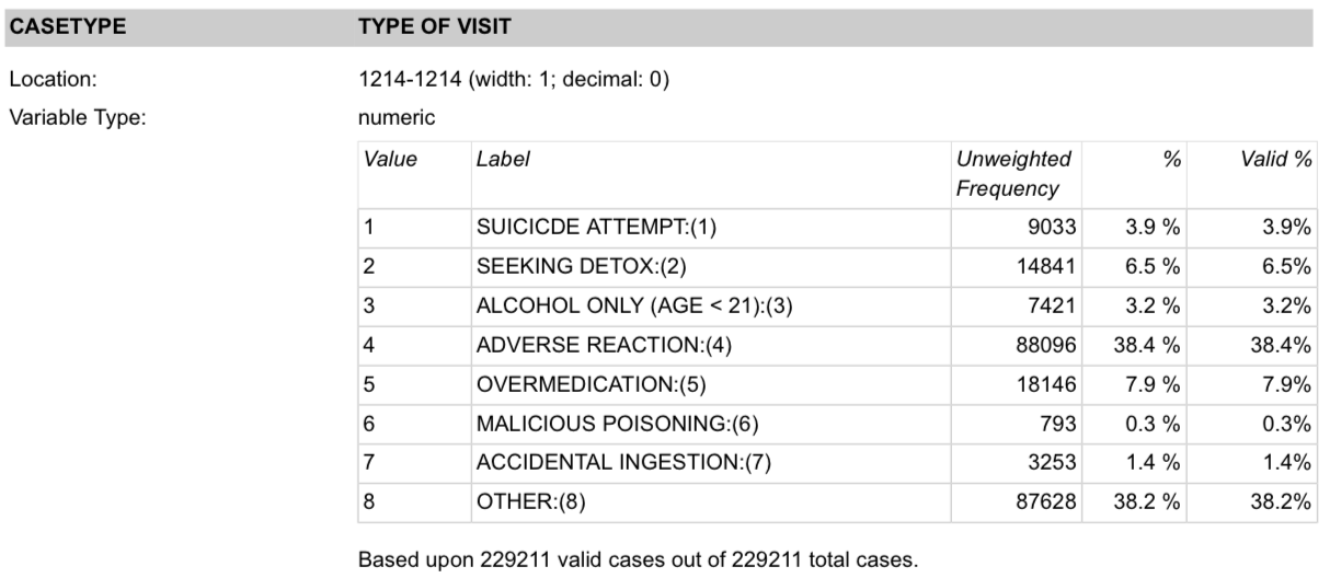 (Screenshot of the description of the emergency room visit type (CASETYPE) variable in the DAWN survey (the typo SUICICDE appears in the actual codebook))
We also want to ensure that the data type matches our expectations. For example, we expect a price to be a number, whether or not it's stored as integer, floating point, or string. Confirming that the units of measurement match what is expected can be another useful quality check to perform (for example, weight values recorded in pounds, not kilograms). We can devise checks for all of these situations.
Other checks can be devised by comparing two related features.
B.2.3 Quality Across Related Features
At times, two features have built-in conditions on their values that we can cross-check for internal consistency. For example, according to the documentation for the DAWN study, alcohol consumption is only considered a valid reason for a visit to the ER for patients under age 21, so we can check that any record with "alcohol" for the type of visit has an age under 21. A cross-tabulation of the features type and age can confirm that this constraint is met:
# DAWN
colspecs = [(0,6), (14,29), (33,35), (35, 37), (37, 39), (1213, 1214)]
varNames = ["id", "wt", "age", "sex", "race","type"]
dawn = pd.read_fwf('data/DAWN-Data.txt', colspecs=colspecs, header=None, index_col=0,
                   names = varNames)

print(pd.crosstab(dawn['age'], dawn['type']))
type     1     2     3      4     5    6     7      8
age
-8       2     2     0     21     5    1     1     36
 1       0     6    20   6231   313    4  2101     69
 2       8     2    15   1774   119    4   119     61
 3     914   121  2433   2595  1183   48    76   4563
 4     817   796  4953   3111  1021   95    44   6188
 5     983  1650     0   4404  1399  170    48   9614
 6    1068  1965     0   5697  1697  140    62  11408
 7     957  1748     0   5262  1527  100    60  10296
 8    1847  3411     0  10221  2845  113   115  18366
 9    1616  3770     0  12404  3407   75   150  18381
 10    616  1207     0  12291  2412   31   169   7109
 11    205   163     0  24085  2218   12   308   1537
The cross-tabulation confirms that all of the alcohol cases (type is 3) have an age under 21 (these are coded as 1, 2, 3, and 4). The data values are as expected.
One last type of quality check pertains to the amount of information found in a feature.
B.2.4 Quality for Analysis
Even when data pass the previous quality checks, problems can arise with its usefulness. For example, if all but a handful of values for a feature are identical, then that feature adds little to the understanding of underlying patterns and relationships. Or if there are too many missing values, especially if there is a discernible pattern in the missing values, our findings may be limited. Plus, if a feature has many bad/corrupted values, then we might question the accuracy of even those values that fall in the appropriate range.
We see in the following code that the type of restaurant inspection in San Francisco can be either routine or from a complaint. Since only one of the 14,000+ inspections was from a complaint, we lose little if we drop this feature, and we might also want to drop that single inspection since it represents an anomaly:
# inspections
insp = pd.read_csv("data/inspections.csv")

insp['type'].value_counts()
type
routine      14221
complaint        1
Name: count, dtype: int64
Once we find problems with our data, we need to figure out what to do.
B.2.5 Fixing the Data or Not
When you uncover problems with the data, essentially you have four options: leave the data as is; modify values; remove features; or drop records.
- Leave it as is: Not every unusual aspect of the data needs to be fixed. You might have discovered a characteristic of your data that will inform you about how to do your analysis and otherwise does not need correcting. Or you might find that the problem is relatively minor and most likely will not impact your analysis, so you can leave the data as is. Or, you might want to replace corrupted values with
NaN. - Modify individual values: If you have figured out what went wrong and can correct the value, then you can opt to change it. In this case, it's a good practice to create a new feature with the modified value and preserve the original feature, like in the CO2 example.
- Remove a column: If many values in a feature have problems, then consider eliminating that feature entirely. Rather than exclude a feature, there may be a transformation that allows you to keep the feature while reducing the level of detail recorded.
- Drop records: In general, we do not want to drop a large number of observations from a dataset without good reason. Instead, try to scale back your investigation to a particular subgroup of the data that is clearly defined by some criteria, and does not simply correspond dropping records with corrupted values. When you discover that an unusual value is in fact correct, you still might decide to exclude the record from your analysis because it's so different from the rest of your data and you do not want it to overly influence your analysis.
Whatever approach you take, you will want to study the possible impact of the changes that you make on your analysis. For example, try to determine whether the records with corrupted values are similar to one another, and different from the rest of the data.
Quality checks can reveal issues in the data that need to be addressed before proceeding with analysis.
One particularly important type of check is to look for missing values. We suggested
that there may be times when you want to replace corrupted data values with
NaN, and hence treat them as missing. At other times, data might arrive
missing. What to do with missing data is an important topic, and there is a lot
of research on this problem; we cover ways to address missing data in the next section.
B.3 Missing Values and Records
In LDS (Chapter 3), we considered the potential problems when the population and the access frame are not in alignment, so we can't access everyone we want to study. We also described problems when someone refuses to participate in the study. In these cases, entire records/rows are missing, and we discussed the kinds of bias that can occur due to missing records. If nonrespondents differ in critical ways from respondents or if the nonresponse rate is not negligible, then our analysis may be seriously flawed. The example in LDS (Chapter 3) on election polls showed that increasing the sample size without addressing nonresponse does not reduce nonresponse bias. Also in that chapter, we discussed ways to prevent nonresponse. These preventive measures include using incentives to encourage response, keeping surveys short, writing clear questions, training interviewers, and investing in extensive follow-up procedures. Unfortunately, despite these efforts, some amount of nonresponse is unavoidable.
When a record is not entirely missing, but a particular field in a record is
unavailable, we have nonresponse at the field level. Some datasets use a
special coding to signify that the information is missing. We saw that the Mauna
Loa data uses -99.99 to indicate a missing CO2 measurement. We found only seven of these
values among 738 rows in the table.
In this case, we showed that these missing values have little impact on the analysis.
The values for a feature are called missing completely at random when those records with the missing data are like a randomly chosen subset of records. That is, whether or not a record has a missing value does not depend on the unobserved feature, the values of other features, or the sampling design. For example, if someone accidentally breaks the laboratory equipment at Manua Loa and CO2 is not recorded for a day, there is no reason to think that the level of CO2 that day had something to do with the lost measurements.
At other times, we consider values missing at random given covariates (covariates are other features in the dataset). For example, the type of an ER visit in the DAWN survey is missing at random given covariates if, say, the nonresponse depends only on race and sex (and not on the type of visit or anything else). In these limited cases, the observed data can be weighted to accommodate for nonresponse.
In some surveys, missing information is further categorized as to whether the
respondent refused to answer, the respondent was unsure of the answer, or the interviewer
didn't ask the question. Each of these types of missing values is recorded
using a different value. For example, according to the codebook, many questions in the DAWN survey use a
code of -7 for not applicable, -8 for not documented, and -9 for missing.
Codings such as these can help us further refine our study of nonresponse.
After nonresponse has occurred, it is sometimes possible to use models to predict the missing data. We describe this process next. But remember, predicting missing observations is never as good as observing them in the first place.
At times, we substitute a reasonable value for a missing one to create a "clean" dataframe. This process is called imputation. Some common approaches for imputing values are deductive, mean, and hot-deck imputation.
In deductive imputation, we fill in a value through logical relationships with other features. For example, here is a row in the business dataframe for San Francisco restaurant inspections. The zip code is erroneously marked as "Ca" and latitude and longitude are missing:
bus[bus['postal_code'] == "Ca"]
| business_id | name | address | city | state | postal_code | latitude | longitude | phone_number | |
|---|---|---|---|---|---|---|---|---|---|
| 5480 | 88139 | TACOLICIOUS | 2250 CHESTNUT ST | San Francisco | CA | Ca | NaN | NaN | +14156496077 |
We can look up the address on the USPS website to get the correct zip code, and we can use Google Maps to find the latitude and longitude of the restaurant to fill in these missing values.
Mean imputation uses an average value from rows in the dataset that aren't missing. As a simple example, if a dataset on test scores is missing scores for some students, mean imputation would fill in the missing value using the mean of the nonmissing scores. A key issue with mean imputation is that the variability in the imputed feature will be smaller because the feature now has values that are identical to the mean. This affects later analysis if not handled properly---for instance, confidence intervals will be smaller than they should be (these topics are covered in LDS (Chapter 17)). The missing values for CO2 in Mauna Loa used a more sophisticated averaging technique that included neighboring seasonal values.
Hot-deck imputation uses a chance process to select a value at random from rows that have values. As a simple example, hot-deck imputation could fill in missing test scores by randomly choosing another test score in the dataset. A potential problem with hot-deck imputation is that the strength of a relationship between the features might weaken because we have added randomness.
For mean and hot-deck imputation, we often impute values based on other records in the dataset that have similar values in other features. More sophisticated imputation techniques use nearest-neighbor methods to find similar subgroups of records and others use regression techniques to predict the missing value.
With all of these types of imputation, we should create a new feature that contains the altered data or a new feature to indicate whether or not the response in the original feature has been imputed so that we can track our changes.
Decisions to keep or drop a record with a missing value, to change a value, or to remove a feature may seem small, but they can be critical. One anomalous record can seriously impact your findings. Whatever you decide, be sure to check the impact of dropping or changing features and records. And be transparent and thorough in reporting any modifications you make to the data. It's best to make these changes programmatically to reduce potential errors and enable others to confirm exactly what you have done by reviewing your code.
The same transparency and reproducible precautions hold for data transformations, which we discuss next.
B.4 Transformations and Timestamps
Sometimes a feature is not in a form well-suited for analysis, and so we transform it. There are many reasons a feature might need a transformation: the value codings might not be useful for analysis; we may want to apply a mathematical function to a feature; or we might want to pull information out of a feature and create a new feature. We describe these three basic kinds of transformations: type conversions, mathematical transformations, and extractions.
- Type conversion: This kind of transformation occurs when we convert the
data from one format to another to make the data more useful for analysis. We
might convert information stored as a string to another format. For example, we
would want to convert prices reported as strings to numeric (like changing the
string
"$2.17"to the number 2.17) so that we can compute summary statistics. Or we might want to convert a time stored as a string, such as"1955-10-12", to apandas Timestampobject. Yet another example occurs when we lump categories together, such as reducing the 11 categories for age in DAWN to 5 groupings. - Mathematical transformation: One kind of mathematical transformation is when we change the units of a measurement from, say, pounds to kilograms. We might make unit conversions so that statistics on our data can be directly compared to statistics on other datasets. Yet another reason to transform a feature is to make its distribution more symmetric (this notion is covered in more detail in LDS (Chapter 10). The most common transformation for handling asymmetry is the logarithm. Lastly, we might want to create a new feature from arithmetic operations. For example, we can combine heights and weights to create body mass indexes by calculating $\text{height} / \text{weight}^2$.
- Extraction: Sometimes we want to create a feature by extraction, where the new feature contains
partial information taken from another feature. For example, the inspection
violations consist of strings with descriptions of violations, and we may only
be interested in whether the violation is related to, say, vermin. We can
create a new feature that is
Trueif the violation contains the word vermin in its text description andFalseotherwise. This conversion of information to logical values (or 0-1 values) is extremely useful in data science. The upcoming example in this chapter gives a concrete use-case for these binary features.
We cover many other examples of useful transformations in LDS (Chapter 10). For the rest of this section, we explain one more kind of transformation related to working with dates and times. Dates and times appear in many kinds of data, so it's worth learning how to work with these data types.
B.4.1 Transforming Timestamps
A timestamp is a data value that records a specific date and time.
For instance, a timestamp could be recorded like Jan 1 2020 2pm or
2021-01-31 14:00:00 or 2017 Mar 03 05:12:41.211 PDT.
Timestamps come in many different formats! This kind of information can be useful for analysis,
because it lets us answer questions like, "What times of day do we have the most website traffic?"
When we work with timestamps, we often need to parse them for easier analysis.
Let's take a look at an example. The inspections dataframe for the San Francisco restaurants includes the date when restaurant inspections happened:
insp.head(4)
| business_id | score | date | type | |
|---|---|---|---|---|
| 0 | 19 | 94 | 20160513 | routine |
| 1 | 19 | 94 | 20171211 | routine |
| 2 | 24 | 98 | 20171101 | routine |
| 3 | 24 | 98 | 20161005 | routine |
By default, however, pandas reads in the date column as an integer:
insp['date'].dtype
dtype('int64')
This storage type makes it hard to answer some useful questions about the data.
Let's say we want to know whether inspections happen more often on weekends or weekdays.
To answer this question, we want to convert the date column to the pandas Timestamp
storage type and extract the day of the week.
The date values appear to come in the format YYYYMMDD, where YYYY,
MM, and DD correspond to the four-digit year, two-digit month, and two-digit day, respectively.
The pd.to_datetime() method can parse the date strings into objects, where
we can pass in the format of the dates as a
date format string:
date_format = '%Y%m%d'

insp_dates = pd.to_datetime(insp['date'], format=date_format)
insp_dates[:3]
0   2016-05-13
1   2017-12-11
2   2017-11-01
Name: date, dtype: datetime64[ns]
We can see that the insp_dates now has a dtype of datetime64[ns], which
means that the values were successfully converted into pd.Timestamp objects.
(This dtype means that pandas uses 64 bits of memory for each value and that each datetime is accurate to the nanosecond (or ns, for short).)
Note: The
pd.to_datetime()method tries to automatically infer the timestamp format if we don't pass in theformat=argument. In many cases,pandaswill parse the timestamps properly. However, sometimes the parsing doesn't output the correct timestamps (as in this case), so we must explicitly specify the format.
pandas has special methods and properties for Series objects that hold timestamps using the .dt accessor. For instance, we can easily pull out the year for each timestamp:
insp_dates.dt.year[:3]
0    2016
1    2017
2    2017
Name: date, dtype: int32
The pandas documentation has the complete details on the
.dt accessor. By
looking at the documentation,
we see that the .dt.day_of_week attribute gets the day of the week for each
timestamp (Monday = 0, Tuesday = 1, ..., Sunday = 6).
So let's assign new columns to the dataframe that contain both the parsed
timestamps and the day of the week:
insp = insp.assign(timestamp=insp_dates,
                   dow=insp_dates.dt.dayofweek)
insp.head(3)
| business_id | score | date | type | timestamp | dow | |
|---|---|---|---|---|---|---|
| 0 | 19 | 94 | 20160513 | routine | 2016-05-13 | 4 |
| 1 | 19 | 94 | 20171211 | routine | 2017-12-11 | 0 |
| 2 | 24 | 98 | 20171101 | routine | 2017-11-01 | 2 |
Now we can see whether restaurant inspectors favor a certain day of the week by grouping on the day of the week:
insp['dow'].value_counts().reset_index()
| dow | count | |
|---|---|---|
| 0 | 2 | 3281 |
| 1 | 1 | 3264 |
| 2 | 3 | 2497 |
| 3 | 0 | 2464 |
| 4 | 4 | 2101 |
| 5 | 6 | 474 |
| 6 | 5 | 141 |
from plotly.subplots import make_subplots

insp_bar = insp['dow'].value_counts().reset_index()
fig = make_subplots(rows=1, cols=1)
day = ['Mon', 'Tue', 'Wed', 'Thu', 'Fri', 'Sat', 'Sun']

fig.add_bar(x=insp_bar['dow'], y=insp_bar['count'], row=1, col=1)
fig.update_xaxes(ticktext=day, tickvals=np.arange(0, 7, 1))
fig.update_layout(showlegend=False)

As expected, inspections rarely happen on the weekend. We also find that Tuesday and Wednesday are the most popular days for an inspection.
We have performed many wranglings on the inspections table. One approach to tracking these modifications is to pipe these actions from one to the next. We describe the idea of piping next.
B.4.2 Piping for Transformations
In data analyses, we typically apply many transformations to the data, and
it is easy to introduce bugs when we repeatedly mutate a dataframe,
in part because Jupyter notebooks let us run cells in any order we want. As a good
practice, we recommend putting transformation code into functions with helpful
names and using the DataFrame.pipe() method to chain transformations
together.
Let's rewrite the earlier timestamp parsing code into a function and add the timestamps back into the dataframe as a new column, along with a second column containing the year of the timestamp:
date_format = '%Y%m%d'

def parse_dates_and_years(df, column='date'):
    dates = pd.to_datetime(df[column], format=date_format)
    years = dates.dt.year
    return df.assign(timestamp=dates, year=years)
Now we can pipe the insp dataframe through this function using .pipe():
insp = (pd.read_csv("data/inspections.csv")
        .pipe(parse_dates_and_years))
We can chain many .pipe() calls together. For example, we can extract the day of the week from the timestamps:
def extract_day_of_week(df, col='timestamp'):
    return df.assign(dow=df[col].dt.day_of_week)

insp = (pd.read_csv("data/inspections.csv")
        .pipe(parse_dates_and_years)
        .pipe(extract_day_of_week))
insp
| business_id | score | date | type | timestamp | year | dow | |
|---|---|---|---|---|---|---|---|
| 0 | 19 | 94 | 20160513 | routine | 2016-05-13 | 2016 | 4 |
| 1 | 19 | 94 | 20171211 | routine | 2017-12-11 | 2017 | 0 |
| 2 | 24 | 98 | 20171101 | routine | 2017-11-01 | 2017 | 2 |
| 3 | 24 | 98 | 20161005 | routine | 2016-10-05 | 2016 | 2 |
| 4 | 24 | 96 | 20160311 | routine | 2016-03-11 | 2016 | 4 |
| ... | ... | ... | ... | ... | ... | ... | ... |
| 14217 | 94012 | 90 | 20180112 | routine | 2018-01-12 | 2018 | 4 |
| 14218 | 94133 | 100 | 20171227 | routine | 2017-12-27 | 2017 | 2 |
| 14219 | 94142 | 100 | 20171220 | routine | 2017-12-20 | 2017 | 2 |
| 14220 | 94189 | 96 | 20171130 | routine | 2017-11-30 | 2017 | 3 |
| 14221 | 94231 | 85 | 20171214 | routine | 2017-12-14 | 2017 | 3 |
14222 rows × 7 columns
There are several key advantages of using pipe(). When there are many
transformations on a single dataframe, it's easier to see what transformations
happen since we can simply read the function names. Also, we can reuse
transformation functions for different dataframes. For instance, the viol
dataframe, which contains restaurant safety violations, also has a date
column.
This means we can use .pipe() to reuse the timestamp parsing function without
needing to write extra code. Convenient!
viol = (pd.read_csv("data/violations.csv")
        .pipe(parse_dates_and_years))
viol.head(2)
| business_id | date | description | timestamp | year | |
|---|---|---|---|---|---|
| 0 | 19 | 20171211 | Inadequate food safety knowledge or lack of ce... | 2017-12-11 | 2017 |
| 1 | 19 | 20171211 | Unapproved or unmaintained equipment or utensils | 2017-12-11 | 2017 |
A different sort of transformation changes the shape of a dataframe by dropping unneeded columns, taking a subset of the rows, or rolling up the rows to a coarser granularity. We describe these structural changes next.
B.5 Modifying Structure
If a dataframe has an inconvenient structure, it can be difficult to do the analysis that we want. The wrangling process often reshapes the dataframe in some way to make the analysis easier and more natural. These changes can simply take a subset of the rows and/or columns from the table or change the table's granularity in a more fundamental way. In this section, we use the techniques from LDS (Chapter 6) to show how to modify structure in the following ways:
- Simplify the structure: If a dataframe has features that are not needed in our analysis, then we may want to drop these extraneous columns to make handling the dataframe easier. Or if we want to focus on a particular period of time or geographic area, we may want to take a subset of the rows (subsetting is covered in LDS (Chapter 6)). In LDS (Chapter 8), we'll read into our dataframe a small set of features from the hundreds available in the DAWN survey because we were interested in understanding the patterns of type of ER visit by demographics of the patient. In LDS (Chapter 10), we'll restrict an analysis of home sale prices to one year and a few cities in an effort to reduce the impact of inflation and to better study the effect of location on sale price.
- Adjust the granularity: In an earlier example in this chapter,
CO2 measurements were aggregated from monthly averages to yearly averages in order to
better visualize annual trends. In the next section, we provide another example
where we aggregate violation-level data to the inspection level so that it can
be combined with the restaurant inspection scores. In both of these examples, we adjust
the granularity of the dataframe to work with a coarser granularity
by grouping together records and aggregating values.
With the CO2 measurements, we grouped the monthly values from the same year and then
averaged them. Other common aggregations of a group are the number of records,
sum, minimum, maximum, and first or last value in the group. The details of adjusting granularity of
pandasdataframes can be found in LDS (Chapter 6), including how to group by multiple column values. - Address mixed granularity: At times, a dataset might have mixed granularity, where records are at different levels of detail. A common case is in data provided by government agencies where data at the county and state levels are included in the same file. When this happens, we usually want to split the dataframe into two, one at the county level and the other at the state level. This makes county-level and state-level analyses much easier, even feasible, to perform.
- Reshape the structure: Data, especially from government sources, can be shared as pivot tables. These wide tables have data values as column names and are often difficult to use in analysis. We may need to reshape them into a long form. The figure below depicts the same data stored in both wide and long data tables. Each row of the wide data table maps to three rows in the long data table, as highlighted in the tables. Notice that in the wide data table, each row has three values, one for each month. In the long data table, each row only has a value for one month. Long data tables are generally easier to aggregate for future analysis. Because of this, long-form data is also frequently called tidy data.
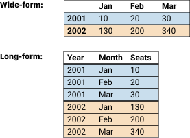 (An example of a wide data table (top) and a long data table (bottom) containing the same data)
To demonstrate reshaping, we can put the CO2 data into a wide dataframe that is like a pivot table in shape. There is a column for each month and a row for each year:
co2_pivot = pd.pivot_table(
    co2[10:34],
    index='Yr',   # Column to turn into new index
    columns='Mo',  # Column to turn into new columns
    values='Avg') # Column to aggregate

co2_wide = co2_pivot.reset_index()

co2_wide
| Mo | Yr | 1 | 2 | 3 | 4 | 5 | 6 | 7 | 8 | 9 | 10 | 11 | 12 |
|---|---|---|---|---|---|---|---|---|---|---|---|---|---|
| 0 | 1959 | 315.62 | 316.38 | 316.71 | 317.72 | 318.29 | 318.15 | 316.54 | 314.80 | 313.84 | 313.26 | 314.8 | 315.58 |
| 1 | 1960 | 316.43 | 316.97 | 317.58 | 319.02 | 320.03 | 319.59 | 318.18 | 315.91 | 314.16 | 313.83 | 315.0 | 316.19 |
The column headings are months, and the cell values in the grid are the CO2 monthly averages. We can turn this dataframe back into a long, aka tall, dataframe, where the column names become a feature, called month, and the values in the grid are reorganized into a second feature, called average:
co2_long = co2_wide.melt(id_vars=['Yr'],
                         var_name='month',
                         value_name='average')

co2_long.head()
| Yr | month | average | |
|---|---|---|---|
| 0 | 1959 | 1 | 315.62 |
| 1 | 1960 | 1 | 316.43 |
| 2 | 1959 | 2 | 316.38 |
| 3 | 1960 | 2 | 316.97 |
| 4 | 1959 | 3 | 316.71 |
Notice that the data has been recaptured in its original shape (although the
rows are not in their original order). Wide-form data is more common when we
expect readers to look at the data table itself, like in an economics article
or news story. But long-form data is more useful for data analysis. For
instance, co2_long lets us write short pandas code to group by either year
or month, while the wide-form data makes it difficult to group by year.
The .melt() method is particularly useful for converting wide-form into long-form data.
These structural modifications have focused on a single table. However, we often want to combine information that is spread across multiple tables. In the next section, we combine the techniques introduced in this chapter to wrangle the restaurant inspection data and address joining tables.
B.6 Example: Wrangling Restaurant Safety Violations
We wrap up this chapter with an example that demonstrates many data wrangling techniques.
Recall that the San Francisco restaurant inspection data are
stored in three tables: bus (for businesses/restaurants), insp (for inspections), and viol (for safety violations). The violations dataset contains detailed descriptions of violations found during an inspection. We would like to capture some of this information and connect it to the inspection score, which is an inspection-level dataset.
Our goal is to figure out the kinds of safety violations associated with lower restaurant safety scores. This example covers several key ideas in data wrangling related to changing structure:
- Filtering to focus on a narrower segment of data
- Aggregation to modify the granularity of a table
- Joining to bring together information across tables
Additionally, an important part of this example demonstrates how we transform text data into numeric quantities for analysis.
As a first step, let's simplify the structure by reducing the data to inspections from one year. (Recall that this dataset contains four years of inspection information.) In the following code, we tally the number of records for each year in the inspections table:
# businesses
bus = pd.read_csv('data/businesses.csv', encoding='ISO-8859-1')

date_format = '%Y%m%d'

def parse_dates_and_years(df, column='date'):
    dates = pd.to_datetime(df[column], format=date_format)
    years = dates.dt.year
    return df.assign(timestamp=dates, year=years)

# inspections
insp = (pd.read_csv("data/inspections.csv")
        .pipe(parse_dates_and_years))

# violations
viol = (pd.read_csv("data/violations.csv")
        .pipe(parse_dates_and_years))

insp['year'].value_counts()
year
2016    5443
2017    5166
2015    3305
2018     308
Name: count, dtype: int64
Reducing the data to cover one year of inspections will simplify our analysis. Later, if we want, we can return to carry out an analysis with all four years of data.
B.6.1 Narrowing the Focus
We restrict our data wrangling to inspections that took place in 2016. Here, we can use the pipe function again in order to apply the same reshaping to both the inspections and violations data frames:
def subset_2016(df):
    return df.query('year == 2016')

vio2016 = viol.pipe(subset_2016)
ins2016 = insp.pipe(subset_2016)
ins2016.head(5)
| business_id | score | date | type | timestamp | year | |
|---|---|---|---|---|---|---|
| 0 | 19 | 94 | 20160513 | routine | 2016-05-13 | 2016 |
| 3 | 24 | 98 | 20161005 | routine | 2016-10-05 | 2016 |
| 4 | 24 | 96 | 20160311 | routine | 2016-03-11 | 2016 |
| 6 | 45 | 78 | 20160104 | routine | 2016-01-04 | 2016 |
| 9 | 45 | 84 | 20160614 | routine | 2016-06-14 | 2016 |
In the previous lab, we found that business_id and timestamp together uniquely identify the inspections (with a couple of exceptions). We also see here that restaurants can receive multiple inspections in a year---business #24 had two inspections in 2016, one in March and another in October.
Next, let's look at a few records from the violations table:
vio2016.head(5)
| business_id | date | description | timestamp | year | |
|---|---|---|---|---|---|
| 2 | 19 | 20160513 | Unapproved or unmaintained equipment or utensi... | 2016-05-13 | 2016 |
| 3 | 19 | 20160513 | Unclean or degraded floors walls or ceilings ... | 2016-05-13 | 2016 |
| 4 | 19 | 20160513 | Food safety certificate or food handler card n... | 2016-05-13 | 2016 |
| 6 | 24 | 20161005 | Unclean or degraded floors walls or ceilings ... | 2016-10-05 | 2016 |
| 7 | 24 | 20160311 | Unclean or degraded floors walls or ceilings ... | 2016-03-11 | 2016 |
Notice that the first few records are for the same restaurant. If we want to bring violation information into the inspections table, we need to address the different granularities of these tables. One approach is to aggregate the violations in some way. We discuss this next.
B.6.2 Aggregating Violations
One simple aggregation of the violations is to count them and add that count to the inspections data table. To find the number of violations at an inspection, we can group the violations by business_id and timestamp and then find the size of each group. Essentially, this grouping changes the granularity of violations to an inspection level:
num_vios = (vio2016
            .groupby(['business_id', 'timestamp'])
            .size()
            .reset_index()
            .rename(columns={0: 'num_vio'}));
num_vios.head(3)
| business_id | timestamp | num_vio | |
|---|---|---|---|
| 0 | 19 | 2016-05-13 | 3 |
| 1 | 24 | 2016-03-11 | 2 |
| 2 | 24 | 2016-10-05 | 1 |
Now we need to merge this new information with ins2016. Specifically, we want to left-join ins2016 with num_vios because there could be inspections that do not have any violations and we don't want to lose them:
def left_join_vios(ins):
    return ins.merge(num_vios, on=['business_id', 'timestamp'], how='left')

ins_and_num_vios = ins2016.pipe(left_join_vios)
ins_and_num_vios
| business_id | score | date | type | timestamp | year | num_vio | |
|---|---|---|---|---|---|---|---|
| 0 | 19 | 94 | 20160513 | routine | 2016-05-13 | 2016 | 3.0 |
| 1 | 24 | 98 | 20161005 | routine | 2016-10-05 | 2016 | 1.0 |
| 2 | 24 | 96 | 20160311 | routine | 2016-03-11 | 2016 | 2.0 |
| 3 | 45 | 78 | 20160104 | routine | 2016-01-04 | 2016 | 7.0 |
| 4 | 45 | 84 | 20160614 | routine | 2016-06-14 | 2016 | 5.0 |
| ... | ... | ... | ... | ... | ... | ... | ... |
| 5438 | 89931 | 100 | 20161207 | routine | 2016-12-07 | 2016 | NaN |
| 5439 | 90041 | 100 | 20161215 | routine | 2016-12-15 | 2016 | NaN |
| 5440 | 90096 | 91 | 20161229 | routine | 2016-12-29 | 2016 | 2.0 |
| 5441 | 90268 | 100 | 20161229 | routine | 2016-12-29 | 2016 | NaN |
| 5442 | 90269 | 100 | 20161229 | routine | 2016-12-29 | 2016 | NaN |
5443 rows × 7 columns
When there are no violations at an inspection, the feature num_vio has
a missing value (NaN). We can check how many values are missing:
ins_and_num_vios['num_vio'].isnull().sum()
np.int64(833)
About 15% of restaurant inspections in 2016 had no safety violations recorded. We can correct these missing values by setting them to 0 if the restaurant had a perfect safety score of 100. This is an example of deductive imputation since we're using domain knowledge to fill in missing values:
def zero_vios_for_perfect_scores(df):
    df = df.copy()
    df.loc[df['score'] == 100, 'num_vio'] = 0
    return df

ins_and_num_vios = (ins2016.pipe(left_join_vios)
                    .pipe(zero_vios_for_perfect_scores))
We can count the number of inspections with missing violation counts again:
ins_and_num_vios['num_vio'].isnull().sum()
np.int64(65)
We have corrected a large number of missing values. With further investigation,
we find that some of the businesses have inspection dates that are close but don't quite match.
We could do a fuzzy match where inspections with dates that are only one or two days apart are matched.
But for now, we just leave them as NaN.
Let's examine the relationship between the number of violations and the inspection score:
def jitter(data, amt=0.2):
    return data + amt * (np.random.rand(len(data)) - 0.5)

fig, ax = subplots(figsize = (5, 5))
ax.scatter(jitter(ins_and_num_vios['num_vio'], amt=0.5), ins_and_num_vios['score'])
ax.set_ylabel('Inspection Score')
ax.set_xlabel('Number of violations')
Text(0.5, 0, 'Number of violations')

As we might expect, there is a negative relationship between the inspection score and the number of violations. We can also see variability in scores. The variability in scores grows with the number of violations. It appears that some violations are more serious than others and have a greater impact on the score. We extract information about the kinds of violations next.
B.6.3 Extracting Information from Violation Descriptions
We saw earlier that the feature description in the violations data frame has a lot of text, including information in square brackets about when the violation was corrected. We can tally the descriptions and examine the most common violations:
vio2016['description'].value_counts().head(15).to_frame()
| count | |
|---|---|
| description | |
| Unclean or degraded floors walls or ceilings | 161 |
| Unapproved or unmaintained equipment or utensils | 99 |
| Moderate risk food holding temperature | 95 |
| Inadequate and inaccessible handwashing facilities | 93 |
| Inadequately cleaned or sanitized food contact surfaces | 92 |
| Improper food storage | 81 |
| Wiping cloths not clean or properly stored or inadequate sanitizer | 71 |
| Food safety certificate or food handler card not available | 64 |
| Moderate risk vermin infestation | 58 |
| Foods not protected from contamination | 56 |
| Unclean nonfood contact surfaces | 54 |
| Inadequate food safety knowledge or lack of certified food safety manager | 52 |
| Improper storage of equipment utensils or linens | 41 |
| Permit license or inspection report not posted | 41 |
| Low risk vermin infestation | 34 |
Reading through these wordy descriptions, we see that some are related to the cleanliness of facilities, others to food storage, and still others to cleanliness of the staff.
Since there are many types of violations, we can try to group them together into larger categories. One way to do this is to create a simple boolean flag depending on whether the text contains a special term, like vermin, hand, or high risk.
With this approach, we create eight new features for different categories of violations. Don't
worry about the particular details of the code for now---this code uses
regular expressions, covered in LDS (Chapter 13). The important idea is that this code creates features containing True or False based on
whether the violation description contains specific words:
def make_vio_categories(vio):
    def has(term):
        return vio['description'].str.contains(term)

    return vio[['business_id', 'timestamp']].assign(
        high_risk        = has(r"high risk"),
        clean            = has(r"clean|sanit"),
        food_surface     = (has(r"surface") & has(r"\Wfood")),
        vermin           = has(r"vermin"),
        storage          = has(r"thaw|cool|therm|storage"),
        permit           = has(r"certif|permit"),
        non_food_surface = has(r"wall|ceiling|floor|surface"),
        human            = has(r"hand|glove|hair|nail"),
    )
vio_ctg = vio2016.pipe(make_vio_categories)
vio_ctg
| business_id | timestamp | high_risk | clean | food_surface | vermin | storage | permit | non_food_surface | human | |
|---|---|---|---|---|---|---|---|---|---|---|
| 2 | 19 | 2016-05-13 | False | False | False | False | False | False | False | False |
| 3 | 19 | 2016-05-13 | False | True | False | False | False | False | True | False |
| 4 | 19 | 2016-05-13 | False | False | False | False | False | True | False | True |
| 6 | 24 | 2016-10-05 | False | True | False | False | False | False | True | False |
| 7 | 24 | 2016-03-11 | False | True | False | False | False | False | True | False |
| ... | ... | ... | ... | ... | ... | ... | ... | ... | ... | ... |
| 38051 | 89687 | 2016-11-29 | False | True | False | False | False | False | False | False |
| 38095 | 89790 | 2016-11-29 | False | False | False | False | False | False | False | True |
| 38147 | 89900 | 2016-12-06 | False | False | False | False | False | False | False | False |
| 38220 | 90096 | 2016-12-29 | False | False | False | False | False | False | False | False |
| 38221 | 90096 | 2016-12-29 | False | True | True | False | False | False | True | False |
15624 rows × 10 columns
Now that we have these new features in vio_ctg, we can find out whether
certain violation categories are more impactful than others. For example,
are restaurant scores impacted more for vermin-related violations than
permit-related violations?
To do this, we want to first count up the violations per business. Then we can merge this information with the inspection information. First, let's sum the number of violations for each business:
vio_counts = vio_ctg.groupby(['business_id', 'timestamp']).sum().reset_index()
vio_counts
| business_id | timestamp | high_risk | clean | food_surface | vermin | storage | permit | non_food_surface | human | |
|---|---|---|---|---|---|---|---|---|---|---|
| 0 | 19 | 2016-05-13 | 0 | 1 | 0 | 0 | 0 | 1 | 1 | 1 |
| 1 | 24 | 2016-03-11 | 0 | 2 | 0 | 0 | 0 | 0 | 2 | 0 |
| 2 | 24 | 2016-10-05 | 0 | 1 | 0 | 0 | 0 | 0 | 1 | 0 |
| 3 | 45 | 2016-01-04 | 0 | 3 | 1 | 0 | 0 | 1 | 3 | 1 |
| 4 | 45 | 2016-06-14 | 0 | 1 | 0 | 1 | 0 | 1 | 1 | 0 |
| ... | ... | ... | ... | ... | ... | ... | ... | ... | ... | ... |
| 4801 | 89599 | 2016-12-15 | 0 | 0 | 0 | 0 | 1 | 0 | 0 | 0 |
| 4802 | 89687 | 2016-11-29 | 0 | 2 | 0 | 0 | 0 | 0 | 1 | 0 |
| 4803 | 89790 | 2016-11-29 | 0 | 0 | 0 | 0 | 0 | 0 | 0 | 1 |
| 4804 | 89900 | 2016-12-06 | 0 | 0 | 0 | 0 | 0 | 0 | 0 | 0 |
| 4805 | 90096 | 2016-12-29 | 0 | 1 | 1 | 0 | 0 | 0 | 1 | 0 |
4806 rows × 10 columns
Once again, we use a left join to merge these new features into the
inspection-level data frame.
And for the special case of a score of 100, we set all of the new features to 0:
feature_names = ['high_risk', 'clean', 'food_surface', 'vermin',
                 'storage', 'permit', 'non_food_surface', 'human']
def left_join_features(ins):
    return (ins[['business_id', 'timestamp', 'score']]
            .merge(vio_counts, on=['business_id', 'timestamp'], how='left'))

def zero_features_for_perfect_scores(ins):
    ins = ins.copy()
    ins.loc[ins['score'] == 100, feature_names] = 0
    return ins
ins_and_vios = (ins2016.pipe(left_join_features)
                .pipe(zero_features_for_perfect_scores))
ins_and_vios.head(3)
| business_id | timestamp | score | high_risk | clean | food_surface | vermin | storage | permit | non_food_surface | human | |
|---|---|---|---|---|---|---|---|---|---|---|---|
| 0 | 19 | 2016-05-13 | 94 | 0.0 | 1.0 | 0.0 | 0.0 | 0.0 | 1.0 | 1.0 | 1.0 |
| 1 | 24 | 2016-10-05 | 98 | 0.0 | 1.0 | 0.0 | 0.0 | 0.0 | 0.0 | 1.0 | 0.0 |
| 2 | 24 | 2016-03-11 | 96 | 0.0 | 2.0 | 0.0 | 0.0 | 0.0 | 0.0 | 2.0 | 0.0 |
features = ins_and_vios.melt(id_vars=['business_id', 'timestamp', 'score'],
                             var_name='violation', value_name='num_vios')
features
| business_id | timestamp | score | violation | num_vios | |
|---|---|---|---|---|---|
| 0 | 19 | 2016-05-13 | 94 | high_risk | 0.0 |
| 1 | 24 | 2016-10-05 | 98 | high_risk | 0.0 |
| 2 | 24 | 2016-03-11 | 96 | high_risk | 0.0 |
| 3 | 45 | 2016-01-04 | 78 | high_risk | 0.0 |
| 4 | 45 | 2016-06-14 | 84 | high_risk | 0.0 |
| ... | ... | ... | ... | ... | ... |
| 43539 | 89931 | 2016-12-07 | 100 | human | 0.0 |
| 43540 | 90041 | 2016-12-15 | 100 | human | 0.0 |
| 43541 | 90096 | 2016-12-29 | 91 | human | 0.0 |
| 43542 | 90268 | 2016-12-29 | 100 | human | 0.0 |
| 43543 | 90269 | 2016-12-29 | 100 | human | 0.0 |
43544 rows × 5 columns
features['vio'] = features['num_vios'] > 0
any_vio = {False:"No", True:"Yes"}
features['vio'] = features['vio'].map(any_vio)
features
| business_id | timestamp | score | violation | num_vios | vio | |
|---|---|---|---|---|---|---|
| 0 | 19 | 2016-05-13 | 94 | high_risk | 0.0 | No |
| 1 | 24 | 2016-10-05 | 98 | high_risk | 0.0 | No |
| 2 | 24 | 2016-03-11 | 96 | high_risk | 0.0 | No |
| 3 | 45 | 2016-01-04 | 78 | high_risk | 0.0 | No |
| 4 | 45 | 2016-06-14 | 84 | high_risk | 0.0 | No |
| ... | ... | ... | ... | ... | ... | ... |
| 43539 | 89931 | 2016-12-07 | 100 | human | 0.0 | No |
| 43540 | 90041 | 2016-12-15 | 100 | human | 0.0 | No |
| 43541 | 90096 | 2016-12-29 | 91 | human | 0.0 | No |
| 43542 | 90268 | 2016-12-29 | 100 | human | 0.0 | No |
| 43543 | 90269 | 2016-12-29 | 100 | human | 0.0 | No |
43544 rows × 6 columns
import seaborn as sns

g = sns.catplot(data=features, x='vio', y='score',
            col='violation', col_wrap=4, kind='box', height=2)

g.set_axis_labels( "" , "Inspection score");

B.7 Summary
Data wrangling is an essential part of data analysis. Without it, we risk overlooking problems in data that can have major consequences for our future analysis. This chapter covered several important data wrangling steps that we use in nearly every analysis.
We described what to look for in a dataset after we've read it into a dataframe. Quality checks help us spot problems in the data. To find bad and missing values, we can take many approaches:
- Check summary statistics, distributions, and value counts. LDS (Chapter 10) provides examples and guidance on how to go about checking the quality of your data using visualizations and summary statistics. We briefly mentioned a few approaches here. A table of counts of unique values in a feature can uncover unexpected encodings and lopsided distributions, where one option is a rare occurrence. Percentiles can be helpful in revealing the proportion of values with unusually high (or low) values.
- Use logical expressions to identify records with values that are out of range or relationships that are out of wack. Simply computing the number of records that do not pass the quality check can quickly reveal the size of the problem.
- Examine the whole record for those records with problematic values in a particular feature. At times, an entire record is garbled when, for example, a comma is misplaced in a CSV-formatted file. Or the record might represent an unusual situation (such as ranches being included in data on house sales), and you will need to decide whether it should be included in your analysis.
- Refer to an external source to figure out if there's a reason for the anomaly.
The biggest takeaway for this lab is to be curious about your data. Look for clues that can reveal the quality of your data. The more evidence you find, the more confidence you will have in your findings. And if you uncover problems, dig deeper. Try to understand and explain any unusual phenomena. A good understanding of your data will help you assess whether an issue that you found is small and can be ignored or corrected, or whether it poses a serious limitation on the usefulness of your data. This curiosity mindset is closely connected to exploratory data analysis, the topic of the subsequent lab.